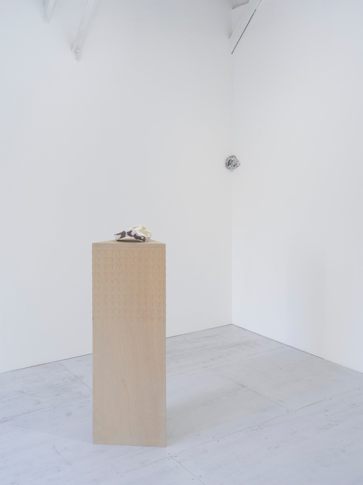
The hollow spaces of the heart; rooms within buildings; worlds within worlds. Chambers are spaces of sanctuary, resonance, and containment; vessels inside vessels designed for the exchange of fluids and sounds. Across her practice, Konstantina Krikzoni constructs spatialised environments that both resemble and contain female bodies; through a visceral palette of pinks and reds, Krikzoni constructs womb-like chambers in which feminine behaviours seep and blossom without limit or restraint. Women kneel, crouch, and recline, captured in intimate moments of metamorphosis or excretion, claiming a place beyond shame and confounding viewers’ social expectations.
Krikzoni’s first solo exhibition at Newchild is intimately concerned with abjection, drawing on Julia Kristeva’s theories around the abjection of the mother. Kristeva argues that society regulates itself by destroying the mother as an object of desire by associating her with the abject, ruling that female bodily fluids, hormones, and hair must be removed, purified, or kept hidden, dealt with behind closed doors. In defiance of these taboos, Krikzoni’s paintings depict the symbolic figures of social theory, but these female archetypes emerge in ambiguous and subversive forms, challenging viewers’ expectations around women’s behaviours.
For example, in paintings such as Fantastical, Orgasmical, figures squat in a way that might suggest sexual provocation, but also suggests the poses adopted while urinating, defecating, or birthing. The works recall how mothers are bound to their children by fluids, from the blood of the afterbirth caught in a cardboard tray to the contents of nappies and the stream of breastmilk into impatient mouths.These female characters embody states of abjection, but in a way that precludes shame and reclaims the abject, thus moving beyond society’s fetishisation of female sexual organs and bodily fluids.
In this exhibition, for the first time one of Krikzoni’s abject figures emerges from the canvas into the three- dimensional space of the gallery. Crafted from the same linen the artist uses to stretch her canvases and adorned with latex and hand-sewn seashells, Cybele evokes a body that is both monstrous and beautiful, powerful and vulnerable. The sculpture takes its title from Cybele, the goddess-mother of Artemis, who is often depicted in classical Greek art as a many-breasted fertility symbol.
Here, as elsewhere in her oeuvre, Krikzoni draws on her Greek heritage and the stories of her female relatives. The musical associations of the exhibition’s title, Chamber, allude to Krikzoni’s studio practice of singing Greek folk songs while she paints, tapping into a tradition kept alive by women through tunes that resonate through the ages.This is part of her interest in exploring her identity as a woman, an artist, and a female body in the studio, considering, for example, how her monthly hormonal cycle affects how she produces work. These concerns are suggested through the depiction of artistic materials within the world of the paintings, where streams of paint squirt from tubes among the naked bodies, positing a connection between the artist’s tools and the abject excreta of the female body.
Krikzoni’s practice has its basis in drawing; her works show the centrality of lines and gestures applied to the paper or canvas with a brush in a cycle of drawing and erasure using thin layers of paint. Several of the works in the exhibition, capture atmosphere and tonality by combining a stained effect with painted lines that resemble stitching.These evocations of textiles are linked to Krikzoni’s heritage and childhood memories; like the chanting of folklore, domestic sewing is part of a wealth of traditional knowledge safeguarded by the minds and bodies of women.
Krikzoni frequently employs the performativity of working at scale, where larger-than-life figures stare confrontationally from the paintings, drawing viewers in as active participants. She uses the canvases as anchoring points in a process of finding a place in the world, creating a series of spaces characterised by acceptance, fluidity, and openness. For Krikzoni, a painting can be a vessel for empathy, a means of transferring the emotion from the body into the creative object.
Society has always placed taboos and boundaries on women’s bodies and behaviour; consequently, it has always feared an uprising of those bodies, a throwing-off of those taboos and those abject designations. In defiance of these social restraints, Krikzoni’s paintings loom large to confront the viewer with sexual organs and defecations and the potential power of the feminine amorphous. Using a visual language of chambers, transformations, and excesses, she explores the relationship between bodies and their surroundings, interrogating the boundaries of fleshliness. This is a painterly world of the abject, but also of life through abjection, in which female bodies and creations are embraced and celebrated.
words by Anna Souter
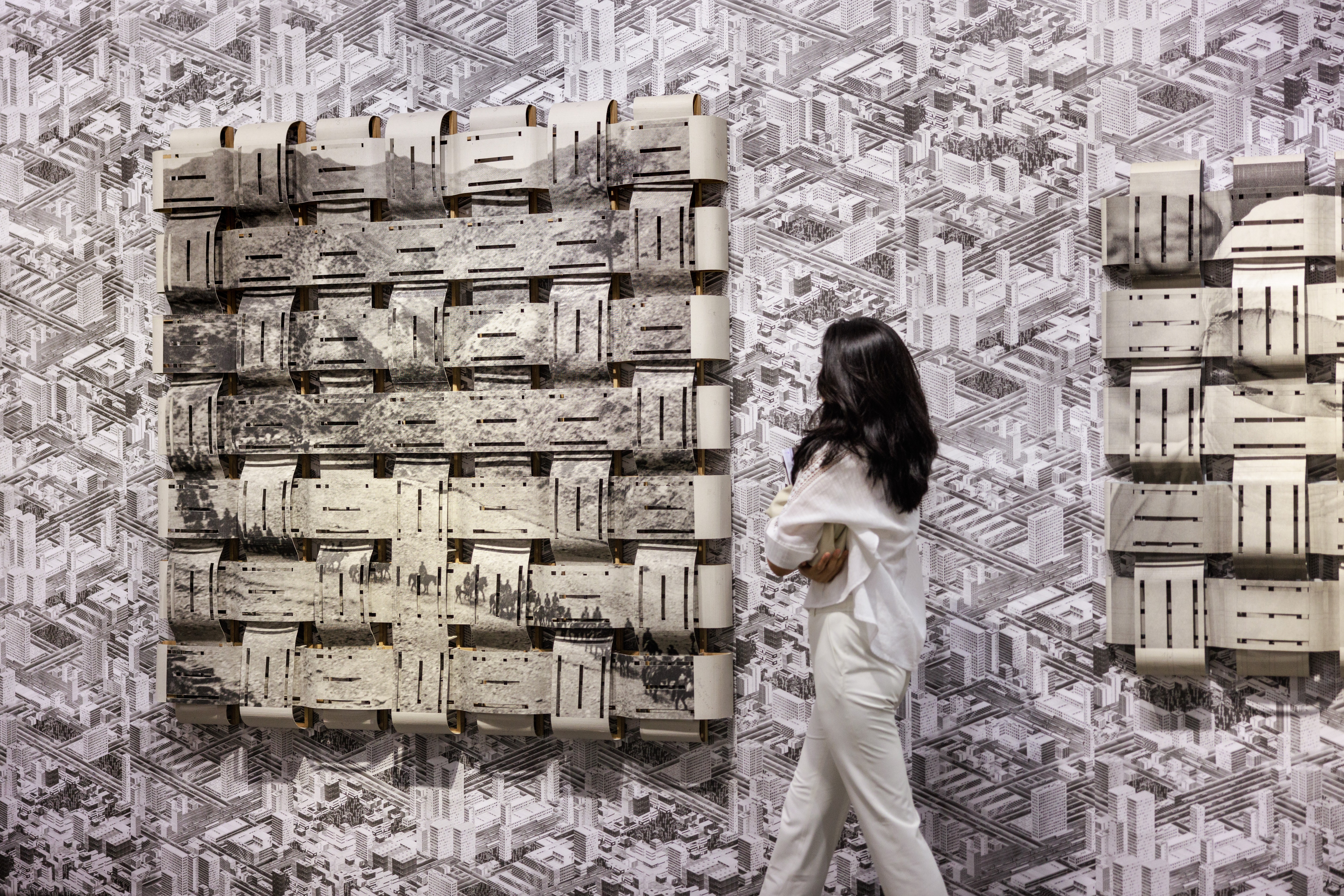
Art Basel concluded the 2023 edition of its Hong Kong show, which was marked by brisk
sales throughout the week and across all levels of the market, and a celebration of its ten-year anniversary in the city and its ever-flourishing arts scene. Staged across two floors
of the HKCEC for the first time since 2019, the show brought together 177 galleries
from across the world – a significant increase from 130 galleries in 2022 – and saw
the return of all special sectors, including Encounters, Film, Kabinett, and
Conversations. 42 galleries rejoined the fair following a hiatus during the pandemic, while
22 galleries made their debut at the fair. For the first time, Encounters extended beyond the
show floor, showcasing a large-scale inflatable sculpture of King Tut by Awol Erizku in
Hong Kong’s Pacific Place. The work was presented by Ben Brown Fine Arts and
supported by Swire Properties, the Official Partner of off-site Encounters.
March 23 – 25
Hong Kong Convention and Exhibition Centre


Lee Ufan, Courtesy Art Basel


Candy Snake Gallery presents Il quarto giorno, the first solo exhibition of Marco Mastropieri (born in Foggia in 1995, lives and works between Venice and Conegliano). The project combines a selection of recent works in which the landscape is the protagonist of a painting that combines the analytical study of plant species with the imaginative and narrative aspect that leads to the construction of a new reality. The title refers to the day dedicated to the creation of the plant world in the biblical story, bringing us back to a nature in the making and without human presence.
At the basis of Marco Mastropieri’s research is the desire to build new and unexplored worlds through landscape painting.
Starting from a method of representation partially inspired by Flemish painting and some 16th century botanists, the visual and sensory stimuli coming from life or from other media are reconstructed through the pictorial sign, taking care to analyze down to the detail the various elements that make up the environment.
The behaviors and movements of plants, taken from scientific studies on plant neurobiology, are the protagonists of the narrative structure of the image. By accentuating everything through deformations and disproportions, the artist gives life to places with a surreal atmosphere.
Among the sources of inspiration, the 1976 book “La botany parallela” by Leo Lionni, a curious text in which a series of imaginary plant species is described with scientific meticulousness, and the works of Gherardo Cibo, a botanical artist who lived in the 16th century, author of one of the oldest herbaria, characterized by an evident alteration of the proportions between the plant in the foreground and the landscape in the background. Other important sources of inspiration from the literary world are the “Dune” saga of science fiction novels, especially the way in which the author, Frank P. Herbert, developed the planet on which the events take place, and the French novel “ The Adventures of Gargantua and Pantagruel”, whose atmospheres are reproduced within the paintings.
The concept of ecosystem is another foundation of Marco Mastropieri’s research, which is developed by considering the connection of the different forms of life and the correspondences between macrocosm and microcosm.
Sometimes gloomy, other times adventurous, Marco Mastropieri’s paintings present landscapes in which every possible human trace is absent, overturning the anthropocentric conception of nature.
In addition to Candy Snake Gallery, he has exhibited at Pal Project (Paris), Palazzo Monti (Brescia), Fondazione Bevilacqua La Masa (Venice), Spazio Antares (Venice), Ca’pier (Venice).
Sally von Rosen
Auguries of Innocene
25 February – 26 March
Mega Foundation
Blekingegatan 8
118 56 Stockholm
.jpg) |
|
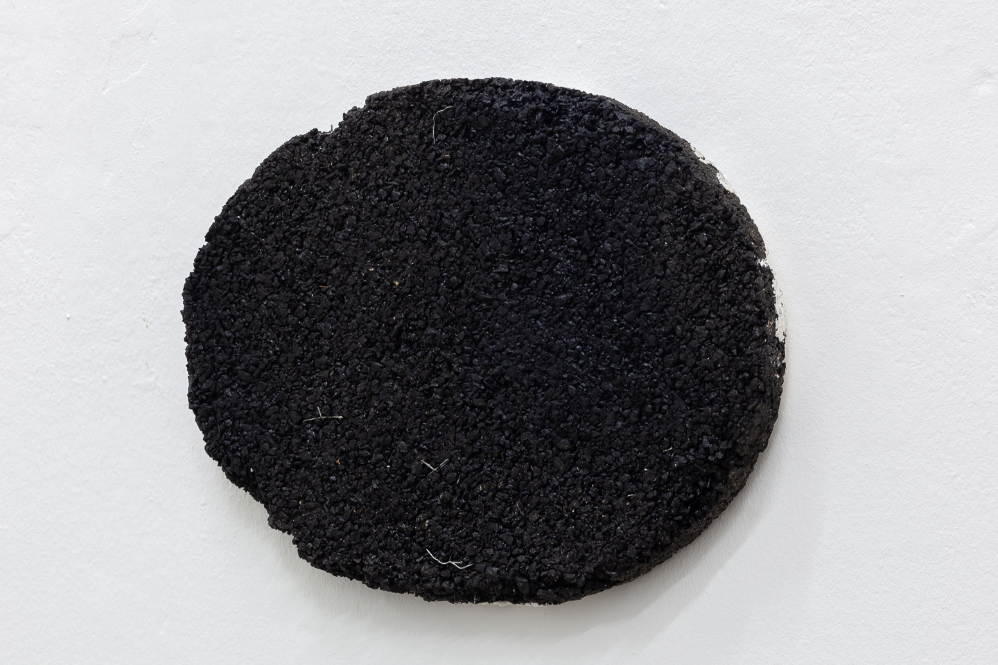
Omen, 2023, Fiberglass, styrofoam, plaster, pigments, glues, epoxy,
photopolymer resin, vegetable oil 70x40x22 cm, Unique |
 |
| Installation view |
 |
| Installation view |
 |
| Installation view |
 |
|
Nemo, 2023, Fiberglass, styrofoam, plaster, pigments, glues, epoxy,
photopolymer resin, vegetable oil 47x35x41 cm, Unique |
 |
|
Nemo, 2023, Fiberglass, styrofoam, plaster, pigments, glues, epoxy,
photopolymer resin, vegetable oil 47x35x41 cm, Unique |
 |
| Installation view |
.jpg) |
|
Nemo, 2023, (close up) Fiberglass, styrofoam, plaster, pigments, glues, epoxy,
photopolymer resin, vegetable oil 47x35x41 cm, Unique |
.jpg) |
|
Nemo, 2023, Fiberglass, styrofoam, plaster, pigments, glues, epoxy,
photopolymer resin, vegetable oil 47x35x41 cm, Unique |
.jpg) |
|
Omen, 2023, Fiberglass, styrofoam, plaster, pigments, glues, epoxy,
photopolymer resin, vegetable oil 70x40x22 cm, Unique |
.jpg) |
|
Omen, 2023, Fiberglass, styrofoam, plaster, pigments, glues, epoxy,
photopolymer resin, vegetable oil 70x40x22 cm, Unique |
 |
|
Omen, 2023, Fiberglass, styrofoam, plaster, pigments, glues, epoxy,
photopolymer resin, vegetable oil 70x40x22 cm, Unique |
,%202022_landscape%20(detail).jpg) |
|
Roseplug (mint green,small), 2022, (close up) Photopolymer resin, vegetable oil
12,5x11x11 cm, Unique |
,%202022_landscape.jpg) |
|
Roseplug (mint green,small), 2022, Photopolymer resin, vegetable oil
12,5x11x11 cm, Unique |
,%202022_portrait%20(detail).jpg) |
|
Roseplug (mint green,small), 2022, (close up) Photopolymer resin, vegetable oil
12,5x11x11 cm, Unique |
,%202022_portrait.jpg) |
|
Roseplug (mint green,small), 2022, Photopolymer resin, vegetable oil
12,5x11x11 cm, Unique |
.jpg) |
|
Sevac i, 2022, (close up) Fiberglass, styrofoam, plaster, pigments,
wood, wire, dispersion glue, latex 102x50x11 cm Unique |
 |
|
Sevac i, 2022, Fiberglass, styrofoam, plaster, pigments,
wood, wire, dispersion glue, latex 102x50x11 cm, Unique |
 |
|
Sevac iv, 2022, Fiberglass, styrofoam, plaster, pigments,
wood, wire, dispersion glue, latex 102x50x11 cm,Unique |
 |
|
Nemo, 2023, Fiberglass, styrofoam, plaster, pigments, glues, epoxy,
photopolymer resin, vegetable oil 47x35x41 cm, Unique |
 |
| Installation view |
 |
| Installation view |
 |
| Installation view |
Sally’s
Instagram
https://daily-lazy.com/wp-content/uploads/2023/03/sally-von-rosen-at-mega-foundation-stockholm-1.jpg


Noriko
Kamikubo creates three-dimensional works using various materials, including resin and ceramic.
Her works are inspired by things that catch her eye in daily life, especially food items such as bread and soup, which
are transformed through her senses into “forms” that allow us to see the taste and even
the smell of the food. The works invite us to a new experience of looking at them as if we were tasting a dish.
Kamikubo’s choice of multiple materials, such as resin and ceramic, plays a role in stimulating the viewer’s “seeing” of the works. When different materials are combined, we unconsciously feel some kind of discomfort. It is the same discomfort as when we would eat a sweet curry, salty shortcake, or sour nikujaga. Just as we notice a slight change in the taste of our usual miso soup, the combination of different materials stimulates our sense of sight and makes us aware of a world different from the one we are used to
*This is one of the
most known Japanese riddles, where the answer is a play on words. The literal
translation is “Bread
is bread but what bread is inedible?” Answer: “A frying
pan.” in Japanese, the word for “bread” is “pan”
Singalong
Ken Kagami, Anders Dickson, Sarah Lyn Rogers
16.03 – 23.04.2023
Sgomento Zurigo
Olivengasse 7 8032 Zürich


You are instructed not to ask what it
is.
You might say, “Tell me about this.”
That would be allowed.
And there are clues: what’s biggest in
the frame, how many fingers.
For some reason the sky won’t touch
the ground.
That’s fine—no need to worry over details like that.
Worry over your own self, skin and
hair, this mass that won’t conform or be obscured.
Have your edges ever felt so
distended?
In childhood you were—like any of
us—geometric, book of unlined paper, no marks.
Adults wore their experience like
scotch tape dragged across the carpet.
They picked up lint and flecks,
mysterious bumps.
Things you felt you oughtn’t be able
to see.
Experienced equated with obscene.
How a folded paper can never be
not-folded.
How the mouth’s assembly line uproots
the teeth you can’t repot.
You can’t go back, but you must go.
Some days you feel like a raw hunk of
meat, set with wire and electrified—some unseen hand pushes a button, makes you
twitch.
Some days a piano squashes you
cartoon-flat.
You spit keys.
Cannot blow out your candles.
Some days are deep-sea dives,
gathering specimens to understand.
To understand what?
The answer.
In your mind, you build construction
sites.
You drive one of the frightening
machines.
Here, you can lift impossible weights.
Break down and discard.
Nothing too much.
Back to skin, this looped image: lip
curl of yuck, ugly sneer.
(A face for lint, loosed teeth, an
errant pube.)
Why would somebody so often hand you
this?
This wordless alphabet of disgust?
With a child’s pride, as though
passing a craft into your hands:
I made this. I made it for you.
– Sarah Lyn Rogers


All images (c) Eason Tsang Ka Wai
Prompt:
Write a 200-word statement, linking algorithmic decision making to desire, habit formation and the tyranny of choice.
Response:
Algorithmic decision making has become ubiquitous in our daily lives, catering to our desires and preferences with remarkable efficiency. With the help of algorithms, we are able to navigate through an overwhelming amount of information and make informed decisions quickly. However, the ease and convenience of algorithmic decision making can also lead to the formation of bad habits. We become overly reliant on technology, passively accepting recommendations without considering their validity or impact on our lives.
Moreover, the abundance of choices presented to us by algorithmic decision making can create a tyranny of choice. Endless options can lead to decision fatigue, anxiety, and even regret. We may become so overwhelmed by the possibilities that we are unable to make a decision at all, leading to missed opportunities and negative consequences.
To avoid falling into the trap of habit formation and the tyranny of choice, it is crucial to be mindful of our desires and actively seek out diverse perspectives and experiences. We must approach algorithmic decision making with a critical eye, considering the potential biases and limitations of the data and algorithms being used. Only then can we ensure that algorithmic decision making remains a force for good in our lives.
演題:
請寫一篇200字的聲明,將算法決策與欲望、習慣形成和選擇暴政聯繫起來。
回應:
算法決策已經成為我們日常生活中無處不在的存在,以驚人的效率迎合我們的欲望和偏好。透過算法的幫
助,我們能夠在海量的信息中快速做出決策。然而,算法決策的便捷性和方便性也可能導致形成不良習慣。
我們過度依賴技術,被動接受推薦而不考慮它們的有效性或對我們生活的影響。
此外,算法決策所呈現的豐富選擇可能會造成選擇的暴政。無盡的選擇可能導致決策疲勞、焦慮甚至後悔。
我們可能會因為可能性太多而無法做出決策,從而錯失機會和產生負面後果。
為了避免落入形成不良習慣和選擇暴政的陷阱,我們必須謹記自己的欲望並積極尋求多元化的觀點和經驗。
我們必須以批判的眼光看待算法決策,並考慮使用的數據和算法的潛在偏見和限制。只有這樣,我們才能確
保算法決策在我們生活中保持為正面的力量。
CREWED
Rachel Fäth, Katharina Hölzl, Jonida Laçi and Vanessa Schmidt
26.1-17.2 2023
new jörg
Jägerstrasse 56
1200 Wien


 All photos by Flavio Palasciano
carrick bell and Rocco Ruglio-Misurell: The End of Living
February 18 – March 19, 2023
Tiger Strikes Asteroid
1206 Maple Avenue, 5th floor, #523, Los Angeles CA 90015


Tiger Strikes Asteroid Los Angeles is pleased
to present The End of Living, a two-person exhibition of new work by
carrick bell and Rocco Ruglio-Misurell. Consisting of video and sound
installation (bell) and sculpture, installation, and drawing (Ruglio-Misurell),
The End of Living sketches out proposals for scavenging pleasure, hope,
and connection in a long apocalyptic now with no guarantee of a future in
sight.
This exhibition is the second part of an
exchange between artist-run spaces in Berlin and Los Angeles; in 2022, bell
& Ruglio-Misurell hosted an exhibition of work from the member artists of
TSALA in their Berlin-based non-profit space, Horse & Pony.
The End of Living takes its name from an inversion of New Queer
Cinema filmmaker Gregg Araki’s first
feature-length film, The Living End. Shot on a minuscule budget with few
resources and fewer permits, Araki’s film took the
crisis of a specific community (in this case, the AIDS epidemic at a particular
moment in the early 1990s) and spun it into a broader generational existential
crisis. Flavored with a strong dose of premillennialist doom, the film asks how
we can continue living in a world that is clearly in its death throes.
Following two HIV-positive men on a Bonnie and Clyde tour of the American West,
The Living End writes a new mythology for how sex, ethics, friendship,
and subcultural resistance can be sustained in a world whose centers of meaning
and coherence have been fractured and sold off.
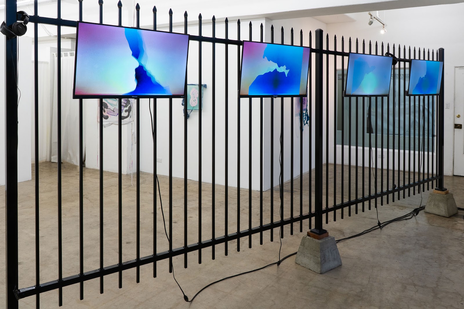
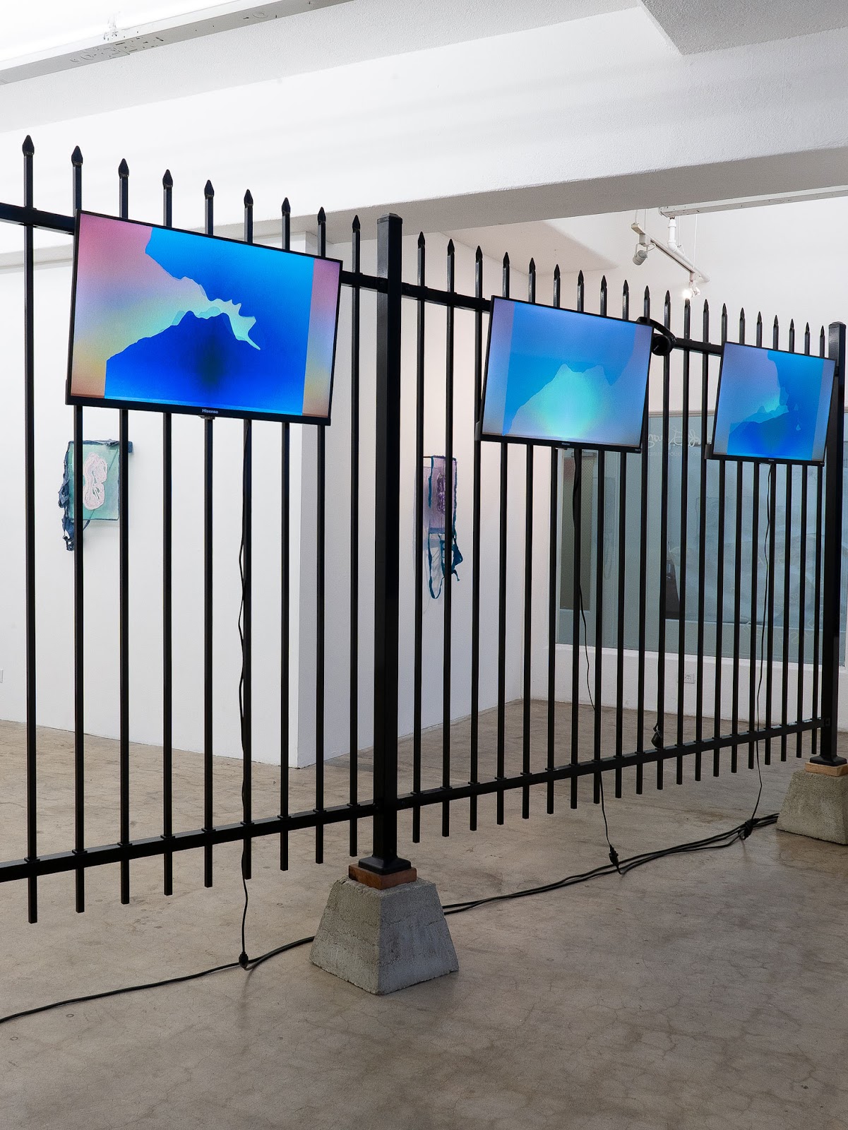
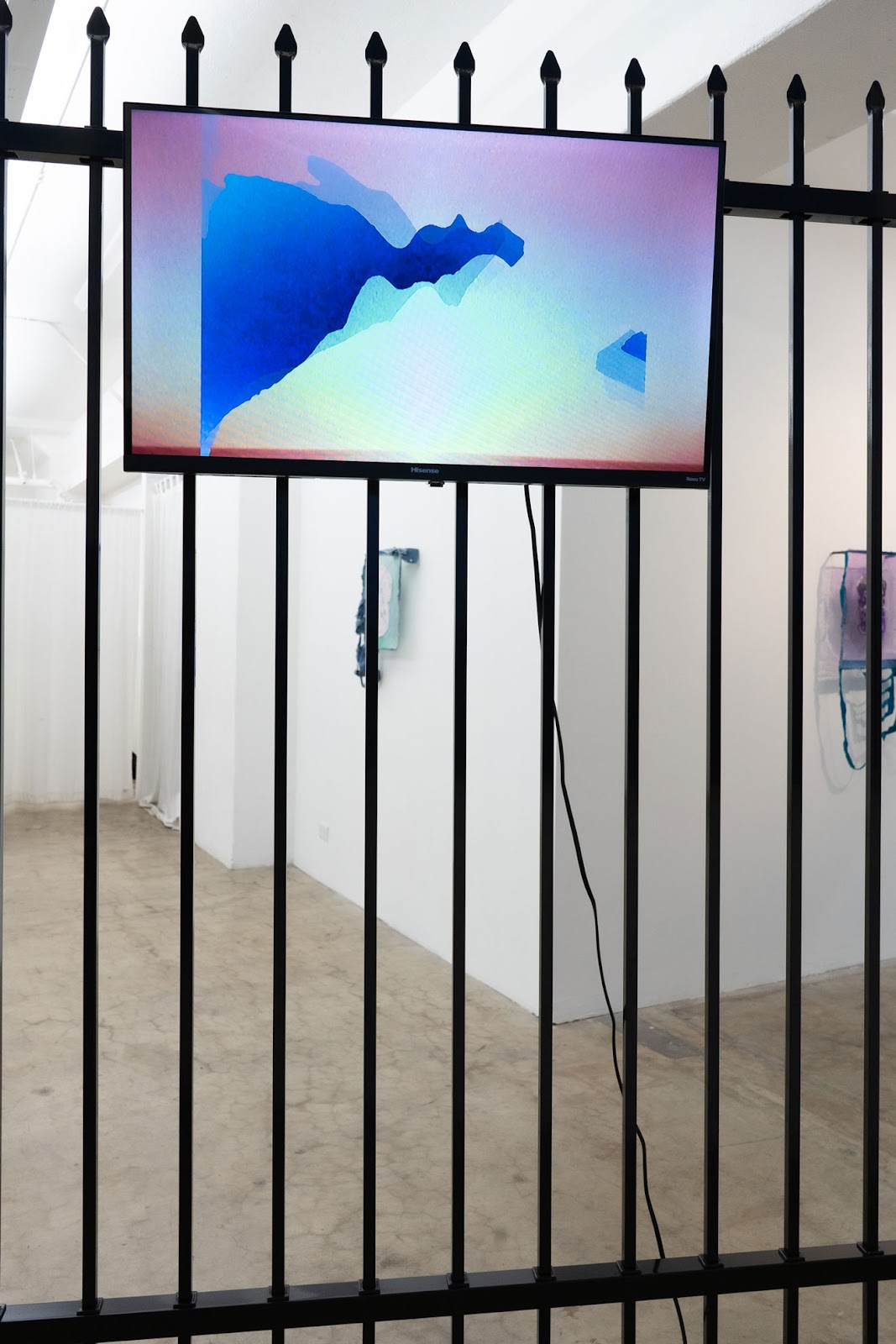
bell’s new video and sound installation directly
engages the source material The Living End, consisting of a multi-screen
video installation mounted to a wrought iron fence installed in front of the
gallery’s windows. The video installation samples,
distorts, and re-edits key fragments from The Living End that amplify
and elaborate moments of physical and erotic (dis)connection, the repetition
and abstraction of found visual material proposing that, rather than seeking to
escape where we find ourselves, we would do best to dig in and find our way
through.
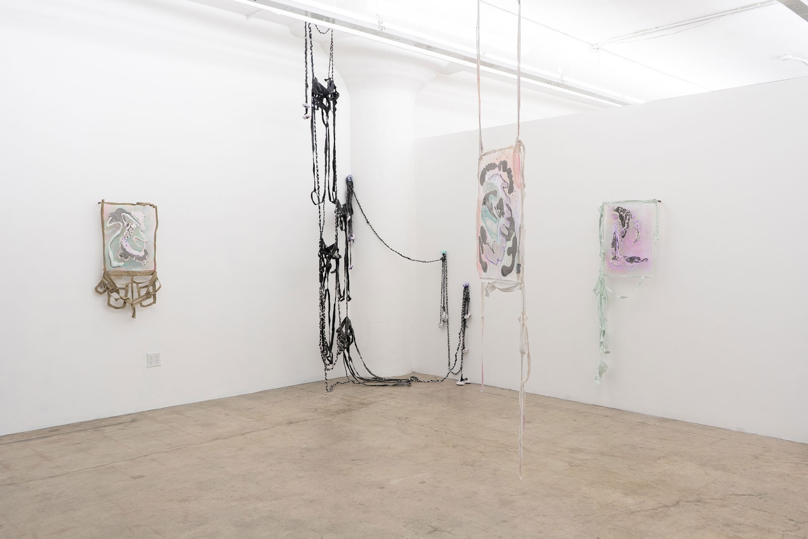
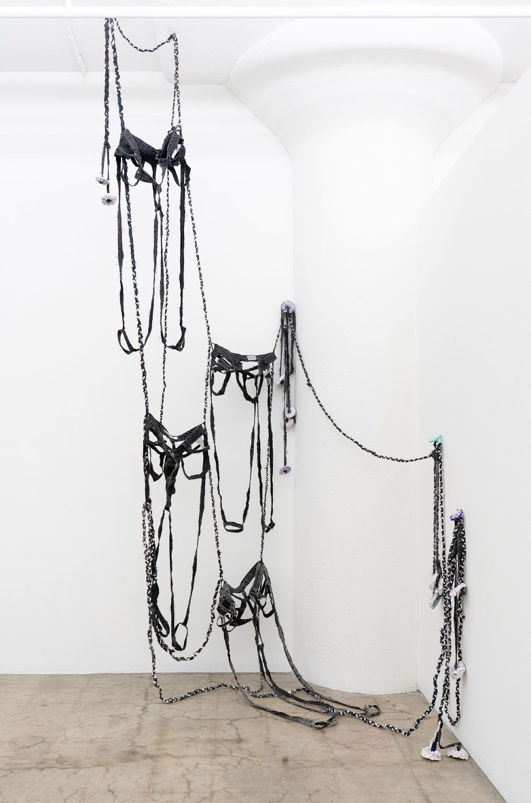
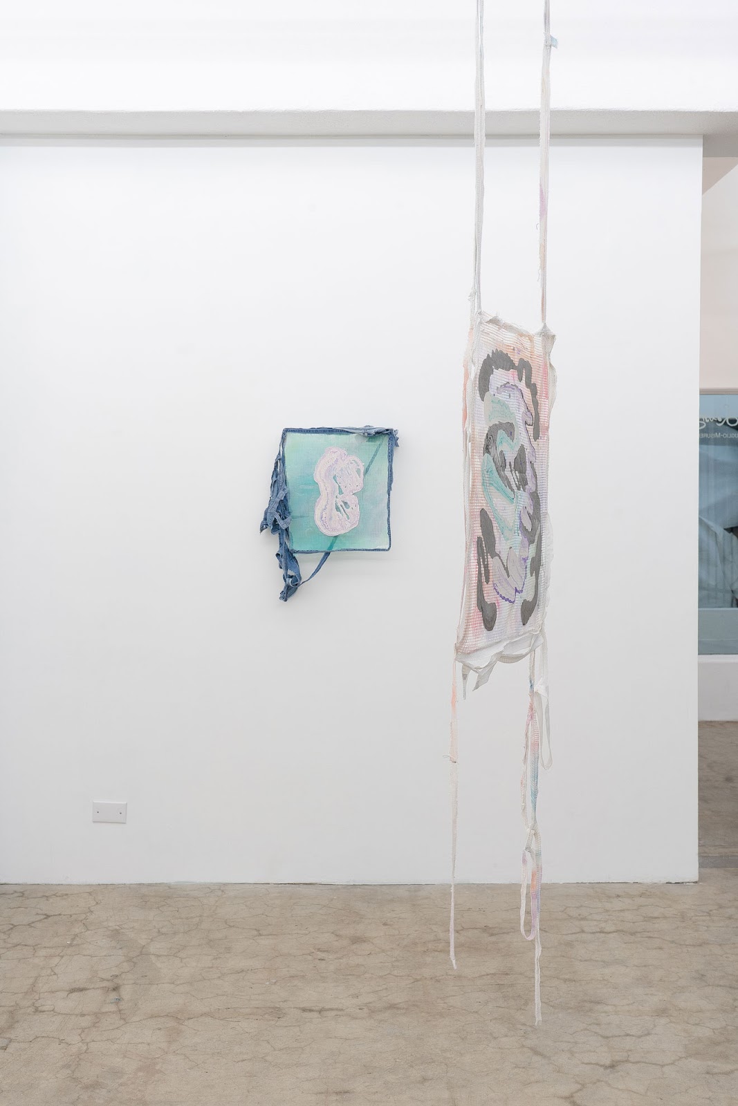
Rocco Ruglio-Misurell presents new works
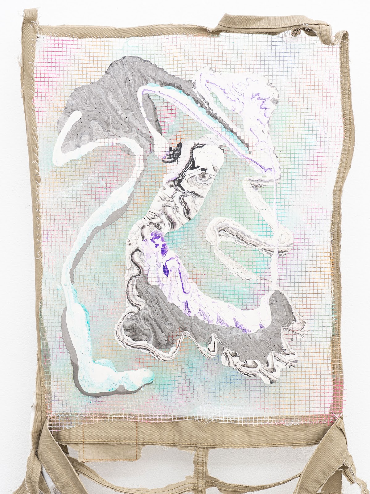
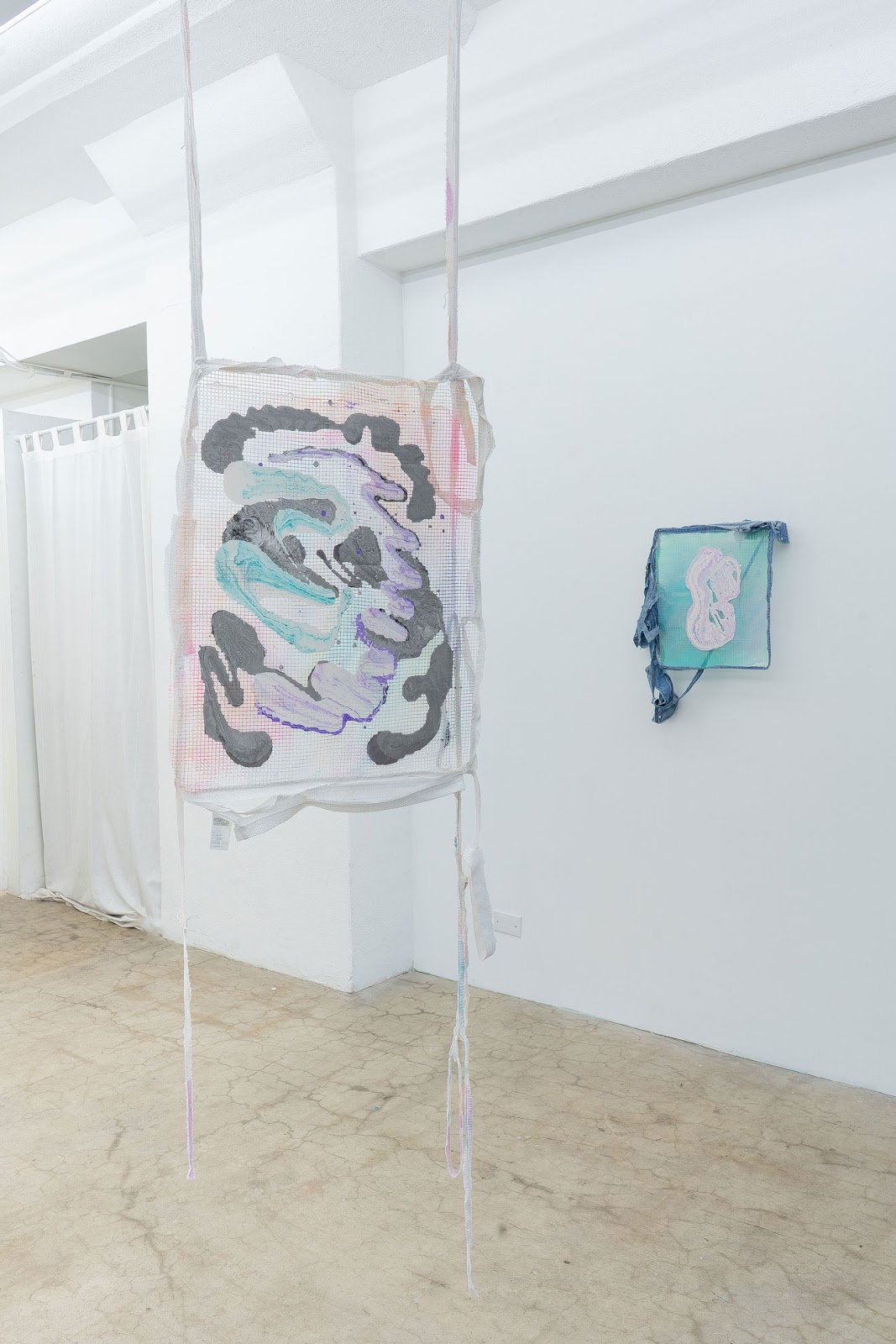
created from used clothing, combined with tinted acrylic and epoxy resins.
Spills, leaks, and organic shapes are captured in thin sheets of mesh
fiberglass, which utilize transparency and result in double-sided paintings. In
addition to the paintings, presented in the corner of the gallery is an
installation made of used jeans that were once worn by both him and his partner
carrick bell – the panels of the pants are cut out, leaving the hems as traces
of the body. Braided denim is connected with cast flowers resembling anuses.
Ruglio-Misurell acknowledges the short life span of garments by including
labels of the fast fashion items in each work. These works don’t offer easy answers to how to escape the
disasters our generations have inherited, but they do have some propositions
for how we can enjoy ourselves and each other as we try to repair.
Bios
Rocco Ruglio-Misurell is a Berlin-based artist with
a BFA from The Art Institute of Boston and an MFA from The School of the Art
Institute of Chicago and was born in Newark, NJ. In 2009, Ruglio-Misurell
received a Fulbright Fellowship to Berlin. Exhibitions include a solo show at
Dzialdov in Berlin (2022), Jak zapomnieć in Kraków (2019), a two-person show at
KH7artspace in Aarhus, Denmark(2018), a solo show at the Helen Day Art Center
in Stowe, VT (2017), and a two-person show at LVL3 in Chicago (2016). Past
residencies include OxBow (2019), Mass Moca (2017), The Wassaic Project (2017),
Vermont Studio Center (2016), Skowhegan (2011), and Ox-Bow (2008).
Along with carrick bell, Ruglio-Misurell is the co-director of Horse
& Pony, an artist-run studio and non-profit exhibition space with the aim of
providing artists, curators, and other project spaces the opportunity to extend
or act outside of their existing practices.
carrick bell is a Berlin-based video
artist and PhD researcher at Chelsea College of Arts. Bell received their MFA
from SAIC in 2008, and a BA from Hampshire College in 2004. They have taught at
Northwestern University and delivered lectures for the School of the Art
Institute of Chicago and NYU’s Tisch School of the Arts. Residencies include Vermont Studio Center
Fellowship Residency (2018); Crosstown Arts, Memphis (2018); NARS Foundation
(2017); the Wassaic Project (2016) and Ox-Bow (2009). They have exhibited at
KH7artspace (Aarhus), Chelsea College (London), Beverly’s New York, Kunsthalle
Exnergasse (Vienna) Charim Gallery (Vienna), LW56 (Vienna), .hbc (Berlin),
Brooklyn Pavillion of the Shanghai Biennial, and BAM (Brooklyn Academy of
Music). They have received stipends for artistic research (Berlin, 2021) and
project space programming (Berlin, 2022). They are the co-founder and
co-director of Berlin-based artist-run space Horse & Pony, and founder and
programmer of Xanadu, a space for artists’ moving image work.


All silence is a hidden space
If it is a great honor for an individual to have their name become part of cultural memory, then the Cloister Apartment as a piece of architecture also enjoys this distinction. Two legends exist about the building: one says it was the private residence of the owners of the British yarn manufacturer Patons & Baldwins, Ltd; the other legend claims that the American businessman Fritz and his wife lived here and hosted literary salons attended by a wide range of Chinese and international luminaries. The Chinese name 花厅 (literally the hall of flowers), on the other hand, comes from the Republican poet Shao Xunmei’s artistic rendition of the salon’s title.
However, the legend of private residences of magnates seems to contradict the name of the apartment. Did the two groups of owners cross paths? Who lived here and when? No primary sources exist about the alleged owners of Patons & Baldwins, and Xue Liyong, a scholar specializing on the history of Shanghai, has concluded that this legend is pseudo-history. According to the tenant registration in the 1930s, seven or eight shareholders and managers of commercial companies and insurance companies lived here, the Fritzes listed among them, which shows that the site served as a high-end apartment building, not a single-family house. The first salon took place in the Cloister Apartment in 1933. Between then and 1937, when Japanese army invaded Shanghai, the salon only continued for three or four years. Little was known about its fate afterwards. Why, then, do wealthy businessmen and the cultural salon dominate the cultural memory of this building? What happened to the salon when concessions stood as the “lone islets” during Japanese occupation? What occurred to the apartment when the Vichy regime abandoned its concession in China in 1943? And during the Civil War? The only known fact is that the apartment became the Hunan Road Subdistrict Office in Xuhui District after Shanghai’s liberation.
The search in the prevailing gaps beyond the myths proves futile. The lacuna, compared to the intact condition of the building’s exterior and interior, creates a sense of absence that is difficult to describe. When the Cloister Apartment served as the subdistrict office, its exterior did not differ much from that today, with only minor functional modifications such as security bars on the windows, bulletin boards on the street, and several white plaques hanging on the front door. Alterations to the interior can only be seen from a few photos online: an addition of golden characters “Unity, Practicality, Pioneering Spirit, Progress” to the foyer, the twisted Solomonic columns painted in the same dark brown color as the floor tiles, and the unused fireplace boarded up. However, the mosaic steps leading to the second floor have been preserved. In 2018, the government initiated a restoration project of the building to bring it back to its original appearance in the 1930s, removing all traces of post-1949 modifications. In restoration practice in modern China, the guiding principle is “restoring the old as it was,” first conceptualized and exercised by Liang Sicheng. But does “the old” refer to the building at its completion, during a certain historic period, or in its current form? The preservation of history means at the same time selection and anchoring of a particular façade. Keeping a specific, unified style and narrative cuts off juxtaposition and amalgamation of different time periods and closes channels between us and a number of fragments from history. In choosing memory, one erases history.
After restoration, the apartment’s interior perfectly showcases details of Spanish architecture such as Corinthian capitals, cast iron scroll grilles, and ornamented fireplaces, but these historic architectural elements can no longer form a reliable narrative in the space. It is difficult to imagine what the subdistrict office looked like in this location, much less to recover the salon in the 1930s. Objects and furniture exist because of people and disappear with them. Architectural elements can be reproduced, but movement of people is difficult to capture and, in fact, leads to the forgetting of historical lineage. These surviving objects can only partially preserve memory, but not the essence of history. The “positive space” of the Cloister Apartment, namely the physical building, shines with unprecedented beauty bestowed by its restoration; its “negative space,” or the traces of human presence in the flow of time, disappear altogether. The blankness of memory is given a legend, one aspect is chosen from the building’s vicissitudes of fortune, and the Cloister Apartment is fixed to a time and space that never existed.
Exploring the absence in the historical narratives of the Cloister Apartment is the exhibition’s departure point. In her work “Archival Memory Room” (2008), the German artist Dorothea Reese-Heim cuts out people’s contours in photographs, perhaps conveying that forgetting and remembering are always relative and that they are interdependent as positive and negative shapes, thus revealing the absence of memory. The Chinese artist Xu Zhe’s work “.wav” (2023) collects the sounds in the apartment, which are transformed and re-released into the space to converge with on-site sounds to form a new soundscape, a metaphor for dislocation in the return of memory.
The Cloister Apartment became a museum that developed from the old French Concession to the present, and it is by itself a museum exhibit. However, has it also become what Adorno calls a “museal” in German, merely “museum like,” without any personal connections? In preserving architectural and material heritage, how much of human activity can we retain from time? The Japanese artist Hikaru Fujii’s practice focuses on the aftermath of the Fukushima nuclear accident, questioning whether we still have the capacity to record and recreate history. Is the museum’s reinterpretation of history also a threat to history? Can these constructed meanings and orders really help us see the reality of time and space in the past? The Georgian artist Vajiko Chachkhiani explores the connection between the individual and collective memory in “Winter Which Was Not There” (2017), implying an attitude of release from metanarrative. Xu Zhe’s new work “Into the Slit” (2023) starts from an individual’s life experience and finally returns to the care between individuals. Individual person is the most difficult to capture in history, but ultimately composes the core of history.
The exhibition title is inspired by “Vertical Poetry” by the Argentinean poet Roberto Juarroz.
Exhibitors: A.MORE Gallery (Milano), A PICK GALLERY (Torino), BIANCHI ZARDIN CONTEMPORARY ART (Milano), Candy Snake Gallery (Milano), Da Opera (Milano), ƎMERGE Project Space (Pescara), ESH Gallery (Milano), ETAJ artist-run space (Bucharest), FOG Gallery (Bratislava), FUR(Y) (Venezia), GAZE OFF (Lugano), MANCASPAZIO (Nuoro).
Artists: Giulio Cassanelli , Roberto Chessa, Judita Csaderovà, Aires de Gameiro, Manuele Geromini, Naomi Gilon, David Hanes, Sasha Katz, Rooy Charlie Lana, Alisa Marchenko, Marco Mastropieri, Razvan Nastase, Simone Negri, Karla Nixon, Aldo Salucci, Chiara Ventura.
Curated by Domenico de Chirico and Marialuisa Pastò
2 – 5 March, 2023
 |
| Installation view |
 |
| Installation view |
 |
| Manuele Geromini, Sans titre Paris, 2022, GAZE OFF [Lugano] |
 |
| Judita Csaderovà, No title – from the series Imprints, 1980-87, Exclusive FOG, Edition 2022, 3 + 1 AP, Silver gelatin print, 28×38 cm, framed 50×60 cm, FOG Gallery [Bratislava] |
 |
| Installation view |
 |
| Installation view |
 |
|
Aldo Salucci, The wheat of love, 2022, Acrylic on silkscreen print on cotton paper ,110×110 cm, A.MORE Gallery [Milan] |
 |
|
Naomi Gilon, Machoire , 2022 , Ceramica grès , 22×15,5×25,5 cm, Candy Snake Gallery [Milan] |
 |
| Installation view |
 |
| Sasha Katz, Radio Silence No 1, 2022, Digital print, 40×50 cm, Print 5/5, Da Opera [Milan] |
 |
| Sasha Katz, Ritual, 2021, Digital print, 40×50 cm, Print 5/5, Da Opera [Milan] |
 |
| Aires de Gameiro, French green, 2022, Oil on cardboard, styrofoam and wood, 85x97x45 cm, A.MORE Gallery [Milan] |
 |
| Marco Mastropieri, Insidia, 2021, Oil on canvas, 150×100 cm, Candy Snake Gallery [Milan] |
 |
|
Karla Nixon, Dune II, 2021, Acrylic paint, archival paper & glue, 100×210 cm, A PICK GALLERY [Turin] |
 |
| Installation view |
 |
|
David Hanes, Savoring, 2022, Oil on canvas, 40.64×30.48 cm, ƎMERGE Project Space [Pescara] |
 |
|
Giulio Cassanelli, PLASMA The Very First 1/2, vintage print, 2001, 15×10 cm (Framed 30X20 cm), GAZE OFF [Lugano] |
 |
| Installation view |
 |
|
Alisa Marchenko, First Kiss – Immersion Series , 2022 , Nylon thread , 47x26x27 cm , BIANCHI ZARDIN CONTEMPORARY ART [Milan] |
 |
|
Simone Negri, Accadimento #105, 2022, Ceramics, 48x40x18 cm, ESH Gallery [Milan] |
 |
| Installation view |
 |
| Installation view |
 |
| Installation view |
 |
| Razvan Nastase, i don’t feel a thing, 2023, 40×32 cm, ETAJ artist-run space [Bucharest] |
 |
| Chiara Ventura, Raggio G, 2021, Carta nera, pellicola, vernice all’acqua rosa, 40×30 cm, FUR(Y) [Venice] |
 |
| Roberto Chessa, Untitled, 2023, Acrilico su carta, 24×32 cm, MANCASPAZIO [Nuoro] |
(un)fair Art Fair is delighted to present (un)choices, a curated space that showcases a selection of the most promising proposals in contemporary art, selected among the ones exhibited in the General Program of the fair by the invited curators Domenico de Chirico and Marialuisa Pastò.
(un)choices aims to give visibility to national and international artists whose artworks mostly share the urgency in pushing the boundaries of possibility as a common thread and that look at the issues of our times.
(un)fair is the next-gen collectors contemporary art fair: a brand new event devoted to contemporary art, galleries, artists, and collectors shaping the world right now. A contemporary art experience full of events, music, talks, and performances, in order to discover a new way to collect art.
https://daily-lazy.com/wp-content/uploads/2023/03/special-feature-unchoices-at-unfair-art-fair-milan-1.jpg
april april
by appointment:
Current Exhibition:
About:
april april is a contemporary art gallery and poetry program currently operating out of an apartment in Brooklyn, NY. To schedule an appointment and retrieve the gallery’s address please email:
Founded by Patrick Bova & Lucas Regazzi

Ashlin Ballif:
Are the artists you work with generally based in New York?
april april:
Over the 10 exhibitions we’ve done, most of the artists actually don’t live in New York, which hasn’t been entirely intentional. Once we noticed that, it felt good to latch onto and to give space to artists mostly working in second cities. Definitely excited to provide a kind of nest for people that don’t get this experience so readily.
It feels as though the affinities are drawn toward things that we’re not seeing all the time in New York. And so for us, that’s meant working with artists who are based in the US that live in Atlanta, Pittsburgh, or Los Angeles. We do want to focus on international artists and try to kind of keep a pulse on things that aren’t so centered in North America. For example, we’re doing a fair in a couple of months with a Singaporean artist. We’re just starting to work with him.
AB: When I visited the space, it felt like a nest, as you said. How did april april come about? What made you think to incorporate the element of poetry alongside exhibitions?
aa: Lucas and I met back in 2018, through an Ekphrastic poetry publication that he and his friend Elora Crawford were starting that I submitted to. So there’s a root interest in writing around art, it’s always been present. We thought it was a ripe opportunity to integrate that on the level of exhibition making…It came from this fundamental idea about the writing that gathers around art. The way that it attributes meaning to the work is nefarious, so poetry felt like an answer as a form to that problem. In that, it is trying to speak in a language similar to art. Not to speak at it, or for it, but rather with it or around it. Trying to think about objects and art as a kind of container for language, that can be mined from or felt around. Of course, this happens through individual channels as poets have different styles and their own writing, but still, there’s a kind of fundamental belief that there are words in the work that are dormant.

Installation View
AB: In the press release for your current exhibition, A Place for Everything, you write, “Cassette tapes and letter presses are but media’s memory. Within these containers, as well as on found industrial ledger papers, Bronson Smillie charts color and form as topographical arrangements. Notation becomes a song.” ‘Notation becomes a song’ feels as if it expresses what is at the core of april april, much like Smillie’s work: the asterisks become the full body or central experience. Oftentimes, these are the elements that are overlooked. What challenges have arisen as you’ve been trying to highlight the poetic aspects of language?
aa: I think that’s a really beautiful way to render the projects that we’re gravitating towards: work that is paying attention to what could be overlooked in an everyday experience. Along with the idea of trying to access the feeling of the work through different poets as channels. The challenge is that it becomes quite abstract or conceptual at a certain point. As such, a bit intimidating in the end, maybe. It’s important to us but we also have been recognizing that it’s a really particular exercise, to engage with this idea about art and poetry as a way of meeting the meaning that exists in the work. Because poetry is so vast, people have an incredible amount of ideas about the form and what it does. So I think we’re meeting our own idea about poetry in this particular context in, you know, in contest with other people’s ideas about it as well. So it’s not always a surefire thing that people are as excited about the practice as we are.
What feels important about it is in making the exhibition more polyphonic, decentered from our singular voice. It is a very particular ask of people, and our selection of poets for shows isn’t always straightforward. It’s just based on a feeling or a sense of affinity. And often, the artists and poets don’t even live in New York so the way that they’re able to experience the exhibition and work is mainly through documentation…Which is a very specific way to perceive the space because our understanding of it (as it’s in our apartment) is from, you know, seven in the morning to midnight. We experience being with the art, as we’re moving about our day.


Luz Carabaño. llamas, 2022. Oil on linen on shaped panel. 10 x 9 inches.
I remember Rachel Oyster Kim, who wrote for our Poem Objects (2022) show, came in and sat down for 30 minutes and the poem was done. An example of a less ready-made experience is from poet CAConrad, they were very busy teaching during the course of our exhibition Unfoldings, but really responded to Luz Carabaño’s work. So they rifled through their archives and chose two poems they felt were akin to the work. So it’s not always “new” language.
Ideally, it is a commission of new writing. However, we’re also coming up against the haste of the exhibition cycle in relation to the length of time it takes to process and produce a poem the poet is satisfied with. It’s a challenging task, and one that we acknowledge is challenging. Therefore, in the previous example with CAConrad, we tried to have more of a curatorial request for the poet to dive into their archive. Which is still a meaningful engagement with the show, providing a counter pose or a resonant node.
AB: What are your thoughts on (Soma)tic poetry? I know CAConrad specializes in that form. The gallery, as previously described as a nest, lends itself to warmth and a comfortable space to hear oneself or feel more centered while working.
aa: I actually attended a Zoom workshop around (Soma)tic poetry that CAConrad was hosting during the height of the pandemic. They walked through their process of creating recipe stations, which was really fascinating and beautiful. It’s interesting how this format, in a way, parallels an exhibition or the way that we’re asking people to approach it. Beyond the fact that it’s situated in this very particular environment, an exhibition is a type of recipe station.
AB: Like poetry, art as a medium is an essence of feeling and also holds the inaccessibility we mentioned earlier–particularly in the sense of abstraction, among other ways. It’s not always like this, in fact often the opposite, but language can be the only thing that people hold on to that makes sense of what they’re seeing. It goes back and forth in that way. How do you curate the poems as part of the exhibition so that it’s available for people to read?
aa: It’s only online at the moment. Usually, the poems in relation to a show get released towards its end or at its very end. So there hasn’t been an explicit experience of someone who has come for a visit having read the poem in relation to the show beforehand. So the poems act as and prompt a returning-to.
Again, because the project is so new, we’re still negotiating this method. It was important to have the show’s run be the duration (in an ideal world) that the poet would come to visit the show, have an experience of it, and then could take that with them to create a poem. But there are ways to better highlight and centralize the poetry program rather than have it seem more like a footnote. We’re still workshopping it. And the intention has always been to take the accumulation of works and publish them as a book. Initially, we were thinking we should include documentation from the show in relation to the poems. We’ve since decided that it will just be the poems in the book as a way to highlight their singularity.
AB: Yes, that difficulty in balance is something I’ve been thinking about since I visited the gallery. On the one hand, as you just described, you want to figure out what work you’re highlighting and who gets the public, visual experience. There’s also a desire I felt to view their combination as an experience: poems alongside the work. I think a publication would be special in that sense. What is the curation process like for you? Is it intuitive on your part or is the artist more involved?

Installation View
aa: It is intuitive in nature, to the extent that it’s a sensibility around the room, and in relation to the work. In this particular instance, the latest exhibition with Bronson Smillie’s works in A Place for Everything was more of an iterative, collaborative process where we were sitting with the work and trying to understand which needed breath. In regard to the asterisks in particular, in the bay window near the floor, it was sort of thinking through the multivalence of the work being that it’s a symbol or icon that usually sits in the top corner of a word or some markup language. On the first wall of the show, in the top left corner, there is a work whose placement evokes that.
At times it can feel like a really difficult space because of its size. It varies though; an artist who came to see the show today said the gallery has the perfect proportions for an exhibition and that it’s an ideal space to work in, which was generous to hear. It was a curious task when we did our first big group show back in September, Poem Objects. We were working with seven artists to negotiate everything in the show. But I still feel like we haven’t tapped the full potential of what can be in the space.

Bronson Smillie. Felt Drawing #10, 2023. Found paper, polycrayon, pencil crayon, cork pad, felt pad, stickers, framed. 14.25 x 11.25 inches.
AB: Also, as a side note, in Smillie’s Felt Drawing #10, the composition reminds me of sheet music. Does their work have any relation to music? Was this a theme that was intentional?
aa: It was moreso in his last exhibition at a space called Maurice in Montréal. The exhibition is called tempo 85 (2022) and has some works that are interpreted as a deconstruction of a piano. Bronson has worked in the past on piano scrolls and within existing grids of these notational pages. In A Place for Everything, the notational becomes a thematic in the work, not necessarily as it relates to music, but as it relates to composition on a line or grid. So either music, math, or cartography.
AB: Do you find that you use the little nooks and crannies of the space? Is it easier to experiment with in that way?

aa: I think the first artist that allowed us to see the space in a more expansive way was Mo Costello, who was in our second show along with Nabil Azab, Juliette, and they, over the course of like, two days, barricaded themself in the room. Did a lot of ritual performances, with objects and tools they brought from Georgia. We heard a lot of banging and clanging from down the hall haha. Mo was engaging with every sort of scene in the room. To this day, there’s still sugar left over on some of the windows—residual Berry Bronco Sauce from Arby’s and peanut butter.
We also invited Chris Andrews, a friend from Montréal, to curate a group show in the space over winter of 2021-22. That was really illuminating as well. Beyond each individual artist’s gestures and placement of works, Bea Fremderman made a site-specific work that was a curtain transformed at its tail into a dress shirt. There were also these two chairs adorned in gowns by HULFE. The show helped to highlight the different ways that artists could respond to the room, and what kind of objects suit the area or could be accommodated by the space. The curation is always collaborative with the artist. I think good curatorial work consists of and is conceived of as collaboration or co-conspiration.


Top: Installation View of exhibition Rattling the Dags, December – February 2022
AB: Are there often site-specific or commissioned works?
aa: Not as common, however, Laura McCoy made some work when she was here. It’s definitely a goal for shows to come. I think it’s also a matter of not having worked with as many artists that identify as installation artists. It’s a question that we were working through, even in this current show. It felt like what we were coming up against often was giving the impression of site-specificity in relation to the work when it didn’t exist. So in some instances, we needed to acknowledge that the work can’t perform that way sometimes or shouldn’t. A balance of pulling back, reading the work, and listening to the work. Always.


AB: Are you looking for the gallery to be a collaborative or public space in terms of programming?
aa: Yes! We hosted our first public reading back in August at Anna Sergeeva’s dear friend books. We’re hoping to do a new iteration of that this spring when it gets warmer. Our most recent one, La Cité des arts, another guest-curated event, was very heavily programmed with guest screenings. Mona Varichon invited other artists to show alongside them, including filmmaker Marie Losier. At the beginning of her screening, she addressed the audience in the format of a talk. She was explaining and contextualizing the work. We deeply want to have more dialogue and reason to incorporate people and their ideas and their work in relation to the space in programs–In the form of talks, readings, and events more broadly. We hosted a reading group as well, a couple of weeks back. A series organized by Darling Green Studio. We had pre-selected a series of texts that the curator offered up and they came by to discuss the screening in relation to the reading.
February 19 – 1 April, 2023
Philippe Daerendinger, Marta Riniker-Radich
Lady Helen
Bonjour Tristesse
Schlesische Str. 7
10997 Berlin


Be running up that road
Be running up that hill
Be running up that building
See, if I only could, oh
In the deep forests of Brandenburg, you can find small square stones at certain crossroads. The stones – Jagensteine – are marked with numbers. Each quarter is numbered to indicate the adjacent Jagen, a topographical area of the forest. Jagensteine are instruments of orientation. Finding one’s way in these forests is not as easy as on the plains. On the plains of this vast and empty land, one finds landmarks such as rivers, streets, electricity pylons and a rare church spire. But in the depths of the forest it is harder. Especially when there are no great elevation changes to help.
From the 17th century onwards Brandenburg has been shaped by the Prussians. As well as cultivating and mapping the land, the Prussians are associated with the promotion of: sincerity, diligence, modesty, conscientiousness, punctuality, righteousness, willingness to make sacrifices, cleanliness, piety, asceticism, honesty, tolerance, reliability, straightforwardness, accuracy, justness, probity, incorruptibility, restraint, and determination. Unending Slog.
These virtues were a colonial strategy, propagated to unite the diverse people of the Prussian Empire, a scattered and often troublesome territory to govern. During the Baroque era the dissemination of these virtues helped to increase economic efficiency, initiating structures for education and administration – the birth of the German bureaucracy.
Navigating with Jagensteine today is very difficult. If one stands in front of a heavily weathered stone, orientation can be impossible. You can’t see the forest for the trees.
The language of navigation is redeployed by today’s super-ambitious, hyper-motivated, go-getting, self-starting, over-achievers. No Jagensteine, but milestones, crossroads, and landmarks; routes to take and peaks to climb. Not necessarily virtuous, but absolutely directional. Advancements in space, upwards or forwards. One landmark after another, leading to an ascent. An uphill battle in a rather hilly country.
JR
https://daily-lazy.com/wp-content/uploads/2023/03/philippe-daerendinger-marta-riniker-radich-at-lady-helen-berlin-1.jpg


London – ZÉRUÌ is delighted to announce ‘Cut from the Shadows’, the first solo exhibition by London based artist Jack Laver. Opening on Wednesday 22nd February from 6 to 9pm, and closing on the 31st March 2023.
Exploring the transformative nature of subliminal imagery, experimenting with pigments, material and insubstantial quality of light, Jack Laver presents a new body of works where sensitivities of chiaroscuros capitulate with materiality, and the will to create. Radiating deep-time and transformation, Laver works offer a site of congealing agency — where a single undulation in a line of ink and pigments relies on all others in the arrangement to find its position. Networks of material passage and bleeding thresholds cling together on each surface. The abstract assemblages of the work dispute impoverished geometries that shape our engagement with the world, and draw us towards notions of entanglement, where shadows cut out the shape of reality.
Jack Laver (b.1998) is a London based multimedia artist and musician. His experiments with ink, adhesive and resin, investigate dependency and dissonance through material passage. These vast surfaces, at times, share a resemblance to action painting, or aerial landscape photography, yet retain their sculptural, fluid presence. What we are offered comes from conditions that are far less concerned with human centred perspectives, and retreat from means of categorisation. The works stand in recognition of materials, and depend on their performance, as oscillating forms resonate with veins, roots, weather systems, or avenues of fractured river systems that cut through the landscape. Even stranger bodies of material discourse have symmetry with their composition. A bridge to that which withdraws from access, hidden by subterranean depths, or the limited perception we gain from our momentary blip of existence. Laver offers nonlinear structures of contemplation that speak to the physical realities of nature.
The exhibition will be accompanied by a text titled ‘Geometries of survival’ by Francesca Hussey.
STILE GAZING
Leonie Kellein, poorspigga, Mira Mann, Frederik Worm, Organ of the Autonomous Sciences
Curated by Adam Varab, Hedvig Greiffenberg & Sofus Keiding Agger @ Salon75
11.2.2023-06.03.2023
Heit, Eichendorffstr. 5, 10115
Berlin


The
third chapter of the Portals exhibition series Stile Gazing presents works by
five positions dealing in each their own ways with strategies of
instrumentalizing the gaze, or through the gaze, then the image. We shape our
tools and thereafter our tools shape us. By either enhancing or dissolving
these systems the works examine the gaze and the structures that produce it. We say, look into the sun and engulf
in what truth you find lying and fall back
wondering what you were even looking at in the first place.
–
Portals
is an exhibition concept initiated by Salon 75 in Copenhagen Denmark, ranging
across Europe and cross-pollinating several similar
platforms. From the summer of 2022 until the summer of 2023,
Salon 75 has facilitated collaborations with
artist-run galleries: Berlinskej Model (Prague), GOMO (Vienna), The Balcony
(Haag), and Heit (Berlin). Each venue partakes in presentations across each others respective platforms.


We are pleased to announce “Quebrada”, a project by Alexandre da Cunha for the auroras’ swimming pool. The work consists of an assemblage of a series of colored awnings that project from the edge of the pool towards the interior, referring to the spatial composition of an impluvium, a small village, a street market, a piazza or a quebrada.
Collecting is part of the artist’s practice. In recent years, a photographic archive of awnings has been formed and the observation of their formal qualities has instigated a pictorial interest. Indeed, they are color planes that stand out from the urban landscape. However, if these objects are often monochromatic or with elementary color compositions, the agency of time and the wear and tear of use give these coverings a special pictorial complexity.
There is a procedural dimension to the creation of the work that allows visitors to “redo it” on other occasions. That is, once the perception of these elements in the urban landscape is sharpened, the public creates its own image collection and selection, also becoming “owners of the work”, or rather, of the procedure, replicating it.
Added to this, another element of interest are the names of the establishments that are printed on the awnings. The “hot dog corner” next to the “office bar and snacks” proposes a neighborhood reconfiguration. The names point to stories lived or imagined in this displacement inherent to the work.
In the library, Alexandre da Cunha shows a work from his series of precast concrete rings and a polished brass element. Usually presented outdoors, the sculpture is shown here inside the house. The two works, therefore, have a logic of displacement: the awnings come from the city to the pool and the sculpture goes from the external environment to the carpeted floor.
Quebrada: the clear enigma of Alexandre da Cunha
Quebrada (2023) is a coherent part of what Alexandre da Cunha (Rio de Janeiro, Brazil, 1969) has been gestating as art: a permanent practice of capturing the eye at an initial moment, and an exercise in seduction regarding those accessing it. At a single moment, the work, because of its scale and presence as a sculptural body, causes us to activate other senses and asks us to move, in a process of spatial recognition. Yet we are immediately betrayed by our eyes, which are already trained and accustomed to the intended proper place for objects, both in their use and their presence.
Just look at what is happening in the auroras patio space: awnings attached and profiled at the edges of a pool that is partially sealing the perception of depth, protecting to no effect an originally wet area from the water and creating there, in this new context, a new compositional space. Not without a bit of humor, the artistic gesture does indeed end up proposing an enigma to us. An enigma defined as art. Or better yet, a clear enigma where a contradiction has been underscored.
I am borrowing this expression from the now historical literary work by Carlos Drummond de Andrade, Claro Enigma [Clear Enigma] (1951), a book of 41 poems that redefined the trajectory of one of the greatest Brazilian poets. This book contains, for instance, “A máquina do mundo” [The machinery of the world], a fundamental poem. Interestingly, this was the book where Drummond would resume his preoccupation with form, with an awareness to meter and rhyme. In a certain sense, this appreciation for form is a key element in the work of Alexandre da Cunha. Despite the triviality of the mass-produced industrial objects, their combination and the formal neatness of their compositions, care for the compositional operation is placed at the center of the artist’s investigation, a sort of search to reveal some unfounded mystery that only art could keep. This work therefore contains the strict sculptural thinking of a tradition that is historically part of the artist’s work, without, nevertheless, losing the present day from sight.
As part of Da Cunha’s process, the objects of and in the world – in this case, the awnings that were once storefronts – are dislocated from the architecturally useful and urban system of which they were a part. They are thus transferred to another context and given new meaning through the arrangement they now make, based on art’s integrative gesture. In the abundance of industrial capitalism, whether collected from urban and/or construction garbage, whether buying materials, tools and parts in the most varied stores and garages, he seeks out objects that can intuitively comprise and formulate what he calls art. In this prospecting, the artist also first creates mental, photographic and physical files on these objects and forms that he finds. The selection of awnings even emerged from this everyday exercise of unpretentious photography. Next, they are consciously grouped through work.
All that is needed to understand this artistic process is to look at the sculpture resting in the auroras library as an example. It is the second unique intervention in this context of an exhibition. As he has usually done in recent productions, he composes a piece with concrete rings, links, and prefab items used in major infrastructure works by cities and that are normally not seen, because they serve as service pipes in the city’s equipment and buildings. The work Alliance V (2022) is therefore similar to a series of works designed as Public Sculptures, always with some sign/term placed in parentheses in the title and that contrasts with the condition of the concrete ring. The sculpture installed in the house is built using two concrete links, one larger and the other smaller, as well as an even smaller ring of polished tin. Placed upright and diagonally, the three elements (in order of size) define a ringed integration where the circles are tangents and are inscribed one upon the other. Their monolithic and balanced presence creates a type of aura around them, which captures the attention of visitors to the library. If the eye had been drawn by the sides of the bookshelves, it is now seduced by the centrally and diagonally placed sculpture.
This transitory nature that Alexandre da Cunha’s art promotes, by dislocating constructive elements in relation to their function, use and recognized meanings, is therefore surely the representation of the concept of art espoused by Robert Morris (1931-2018), one of the major American artists of the late twentieth century, who used to say: “everything that is used as art should be defined as art.” In other words, Duchamp’s dislocation of an industrial object in 1910 was considered a vital operation in the field of art, leading artists to intervene and make use of industrial production lines to build objects. Unlike the minimalists, a group that Morris was part of, the Brazilian artist does not just designate a new identification with his dislocations and appropriations of ordinary artifacts; he also performs and operation that is, above all, semantic, at the level of language. He makes shrewd use of what the barter market system, obsolescence and disposability has to offer him.
For this reason, based on the artist’s transitory action, where meanings and signs are tangled, a series of questions open up to the spectator-visitor. The unaware may hastily ask: what are awnings doing attached to a pool? It is as if they found a supposed loss of value in the use of the objects, now presented in another context. So are objects only relevant if they have some sort of material value for use? Others, however, may ask: but were these awnings collected or were they made for this installation? To better understand, it is fundamental to move closer to find clues that will give us some semantic value in this representation. Further on, we may also ask: is there any direct relation with what we see in the city, in our immediate reality? The sense of enigma that the work holds is therefore amplified while a sort of narrowing of this art is built with the living space that surrounds us.
Alexandre da Cunha has lived and worked in London (United Kingdom) for over two decades, but he frequently works with an attentive eye to the Brazilian context. The artist is always passing through São Paulo, bringing a visual and constructive repertory of these two cities in permanent cycles of construction and destruction, stopping and restarting. Knowing this, paying attention to the name of the installation is important.
Quebrada is a word rich in meaning in the day-to-day language of Brazil. While there is an implied verbal action, as derived from the verb “quebrar” [to break] – its nominal participle, there is also its use as a noun to indicate a small property, a service space, a small group of houses, a market in a public square. At the same time, it could also be a kind of hillside, slope, inclined plane, something that alludes to the nature of an awning. Moreover, the broader meaning immediately recalls a specific condition in the urban environment: in São Paulo and in the other major cities of Brazil, quebrada is a far-flung place, usually on the outskirts, which has a neighborly feel. In addition, it can be a space for negotiation where there is less government control, with space for resistance by disadvantaged populations. It is similar to the idea of a ghetto, a place not only of identification, but of survival as well.
From this rapid derivation of signs that we have seen, a dislocation can be made in meaning toward the value that the artist has given the installation. Name and work gain an intrinsic combination. The signifier and the signified are tangled together, which starts with the appropriation and disarticulation of an inclined functional object that provides protection from sunlight and drains away rainwater and which, when installed, creates a shady space, a transitory place between public and private, and vice versa. The very presence of a group of awnings, turned toward an interior space, provides of sense of a group, a condensation of spaces, but now without their architectural and functional utility playing the leading role. The very repetition of form, side by side or transversally, designates a specific place.
Alexandre da Cunha even outlines a parallel with the idea of impluvium: a Latin word used to identify an architectural device used to centrally collect rainwater in enclosed spaces and internal patios since the immemorial architecture of Greco-Roman times. Ironically, the cycle of signs (meanings and signifiers) made possible by the work returns to the start, to the simple awning, an object with the same functionality that is acquired and adapted to the parapets of the homogenous architecture of large cities. Once again, the clear enigma is provided, a permanent exercise in contradiction of the senses in the artwork.
* * *
The work of Alexandre da Cunha raises other equally relevant questions: the stress on the physical and formal property of the different synthetic materials that make them up and, as a consequence, the protagonism of the colors impregnated in them. The forms provided by the color are therefore hubs of visual attraction. The canvas of each awning selected has vivid and strong colors, whether it is a single color or in two-tone and three-tone compositions, in addition, obviously, to the weathering they show. The arrangement in the pool, suggesting a presence that is analogous to the impluvium, considers the rhythmic composition of bands of color, with warm and vibrant colors standing out.
The observer who had before, from the street, looked upward from below, upon identifying the place by the lettering stickered or painted onto the awning, is looking downward from above at auroras. One must even travel around the entire rectangular space of the pool to identify tiny remnants of their original lettering. The front flap of the awning, which is generally the first identifying element, becomes secondary and residual information in the work. When going around the garden through the back side of the pool, for example, we see the text “Bar e Lanches Escritório.” Once again, there is an approximation with the ambiguity of the clear enigma, a factor that seems decisive to me in the artist’s poetic production.
The strength of color as form gains even more prominence when we reach the third work shown by the artist in the exhibit: a two-dimensional structure called Quebrada I (2023). Literally a sawed-off part of an awning that was later flattened, it is installed in one of the house’s upstairs rooms, in dialog in terms of scale with the window in this area. As is the habit in Modernist homes, the more private rooms are spaced in a specific section of the building, usually on the top floor. This is what we find in this house, designed by Gian Carlo Gasperini (1926-2020) in 1957.
The room’s window, looking out onto the internal patio, provides a generous top view of the Quebrada installation. This strategic placement suggests a visual approximation between the compositions installed at different levels and in different vistas. The two smaller sides of the rectangular room have two openings, a doorway and a window. While the lateral walls are filled with two artworks: in this case, face-to-face contact between the artist’s two-dimensional work and one of the expanded paintings of Sarah Crowner, which we discussed earlier.
Consequently, Blues with red margin (2022) by Crowner and Quebrada I (2023) formulate, in opposition, a dialog of color and form, while at the same time installed with an actual window between them, creating a landscape triptych. In a clockwise direction for those arriving in the room, we see the yellow bordered by the vertical magenta of Da Cunha’s work, the horizon bordered by the window pane, and Crowner’s blues bordered by red.
Bathed in natural light, both works corroborate the idea that color gains primacy through its form. The clear bands of color on the Alexandre da Cunha’s grouped canvases are in contrast and opposition to Sarah Crowner’s canvas of blue curves. If the former has a vertical magenta border, the latter has a horizontal red border that jumps out. Moreover, if that fragment of awning highlights the homogenous texture and magenta of the canvas, the blue nuances in the fabric appear in the curvy scraps of the canvas. Color in form – an essential factor of connection and contrast between the artists’ works – is the foremost reason for the poetic interweaving found there. This is, after all, refinement of the eye through the colors of art, its materials, and formal arrangements.
Diego Matos
Luca Staccioli – WAKE-UP CALL
ArtNoble gallery

_Web_ph%20credit%20Michela%20Pedranti.jpg)